Archer: The visual brand
FVM recently rebranded Market Street Advisors as Archer. Working with the financial services software company through research, value proposition, architecture, naming, tone of voice, and design was a great experience. Our process resulted in a strong, modern and consistent brand designed to give Archer an edge in the market, and it’s something we’re proud of.
While the strategic concepts, rationale and writing were developed by our senior leadership cadre, creating Archer’s visual brand fell on my desk. Now that the brand’s launch is in our rear view mirror and our case study is up, I can offer a peek behind the design curtain.
![]()
The Archer logo is a simple geometric sans-serif wordmark. The R’s slightly exaggerated bowl hints at the opulence of early 20th-century typographic styles, and the flourishes on the A and C—symbolizing an arrow drawn tight in its bow and aimed at its target—provide a modern flair. The bright, gradated color compliments Archer’s warm, friendly and dynamic personality.
I spent days creating and refining round after round of logo concepts, and we were so happy with that work that we struggled separating the wheat from the chaff. We explored a variety of icon-based treatments, and though I always intended on offering some purely typographic marks, a case of severe creative block saw several design rounds come and go before this solution made it up on our creative room’s wall.
Although the C-as-target glyph looks like a self-evident basis for the mark, it was actually the A that initiated the thinking behind this design. Like many of my designs, the idea for the A’s displaced crossbar rudely shoved its way into my head while brushing my teeth late one evening, and the initial sketches were created into the early morning hours in my home office. The target-C was actually not in the first versions at all. The logo’s final state may seem like an obvious solution, but the creative process is often more tangled.
![]()
Once the wordmark was resolved, the rest of the brand’s visuals poured forth more easily. Patterns, icons, illustrations, and other visual elements utilize similar geometric primitives and echo the construction of Archer’s distinctive A. Continuing the geometric motif, type is set in Proxima Nova and Lubalin Graph at mostly lighter weights with generous spacing to create and open, approachable impression. We balanced the somewhat recessive type treatments and straightforward copywriting with a bold, energetic color palette to arrive at the brand’s full personality.
Value proposition and personality
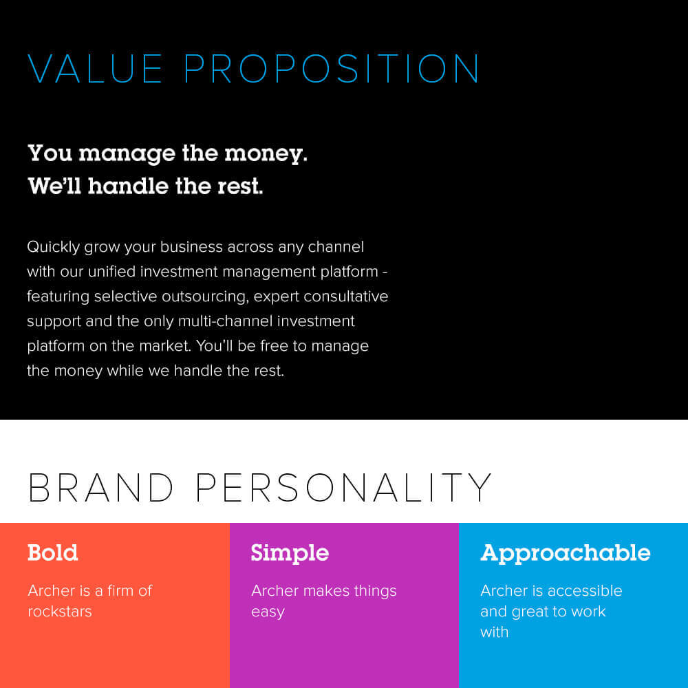
Like the wordmark, Archer’s secondary blue was also a late arrival in the creative process, but one that I think rounds out the palette and lends a bit of sobriety to the otherwise loud visual impression of orange, purple and black.
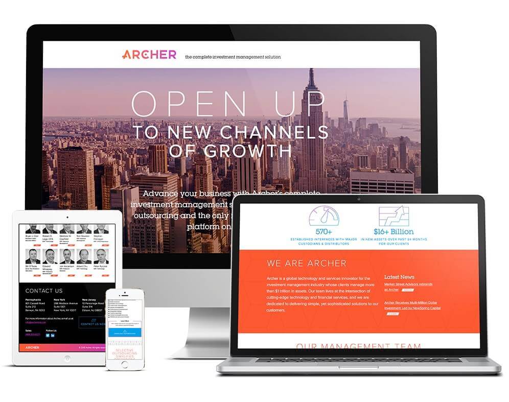
Digital properties
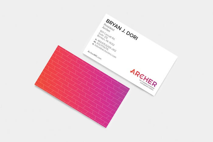
Business card
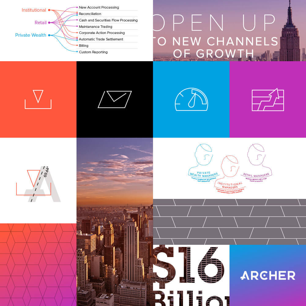
Visual brand elements
When viewed against the more traditional visual branding of others in the investment management sector, our approach positions Archer as a bold, new and forward-thinking competitor. However, the landing page that introduced Archer is just the beginning. We’re now kicking off a more comprehensive web design process to build Archer’s modest digital presence into a full site, and I’m excited to see how the brand ultimately lends itself to a fuller, more robust interactive experience. So stay tuned, as I’m sure we’ll have more to show of Archer’s creative development in the coming months.